
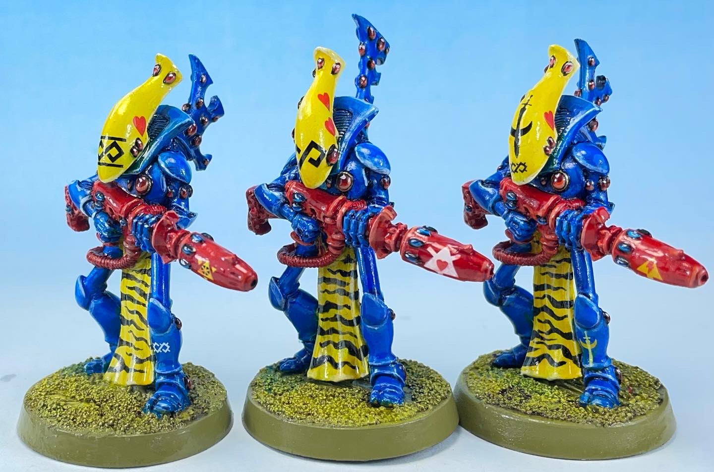
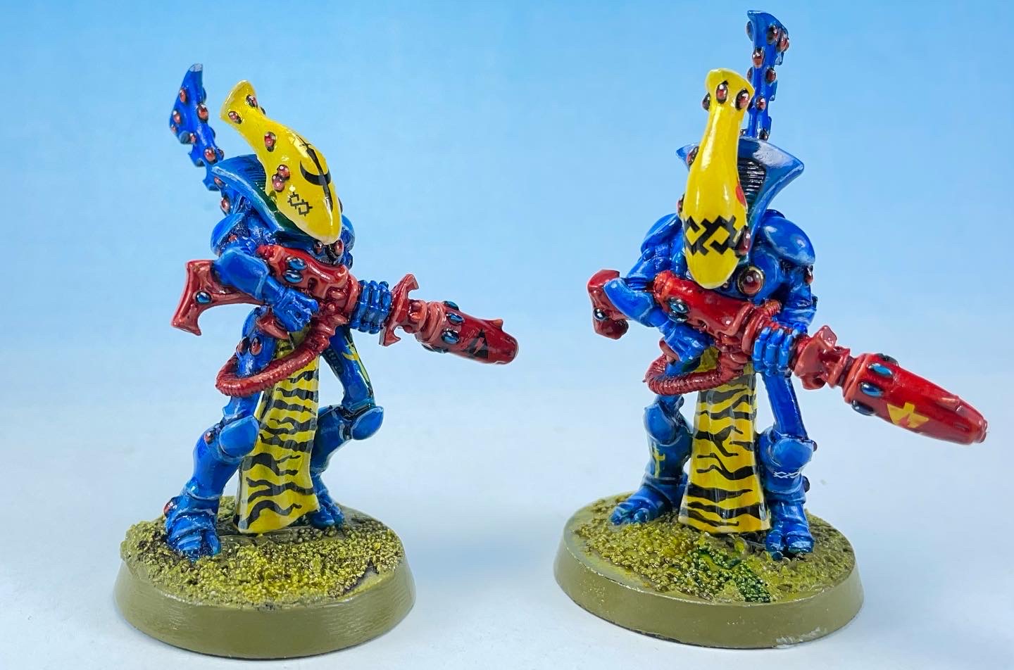
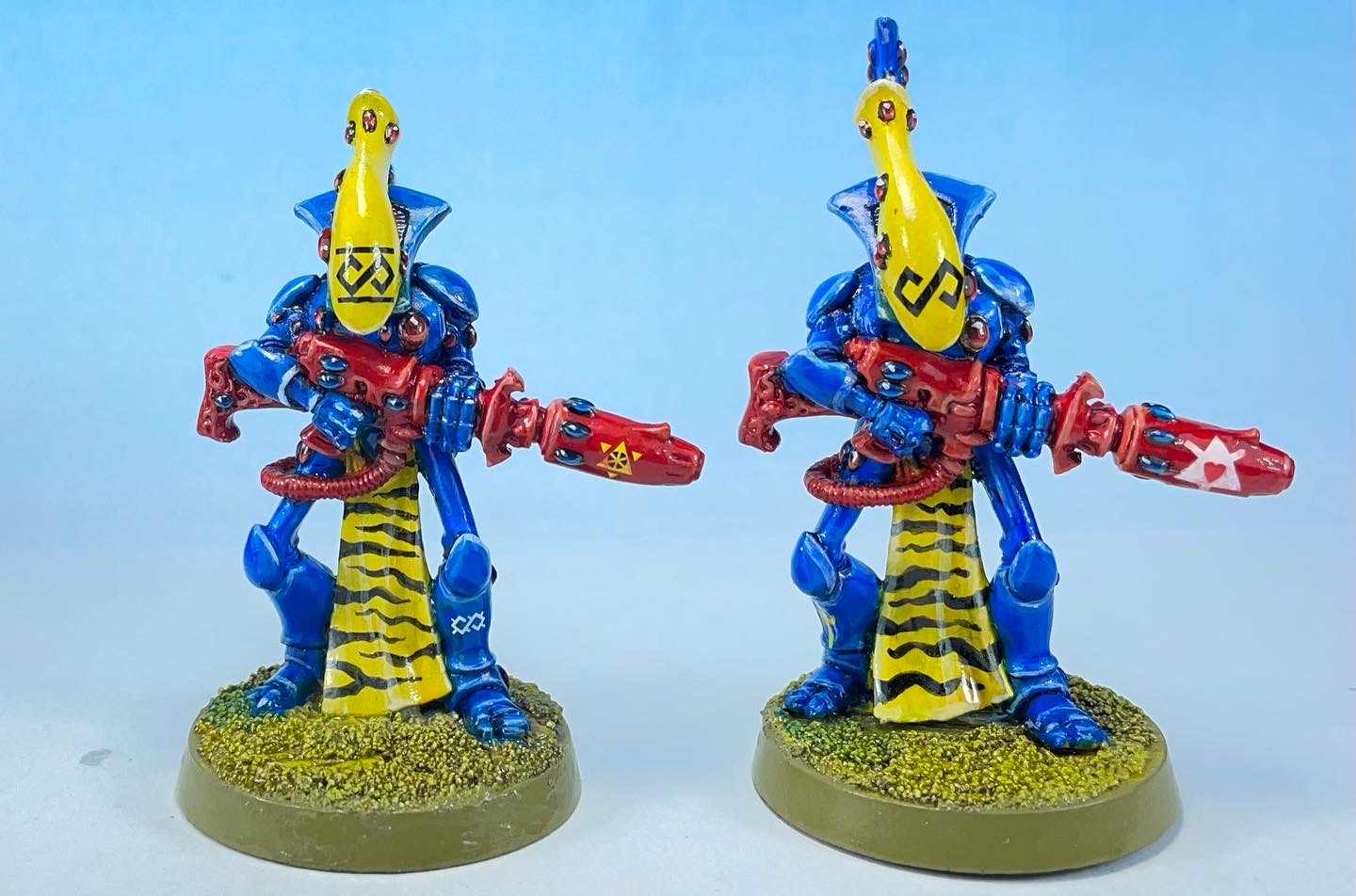
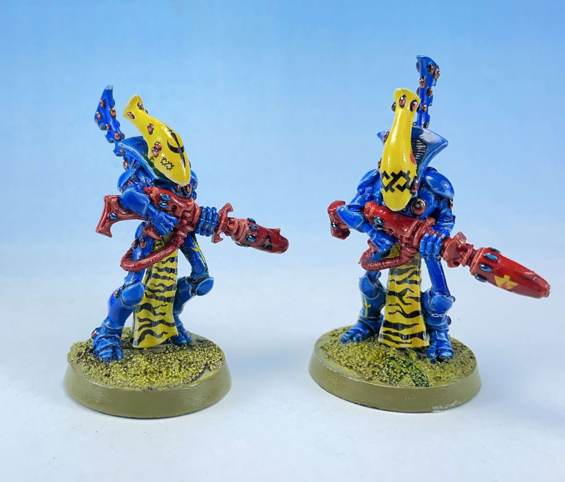
For Month 2 of the Challenge I finished 5 classic wraithguard.
Not too much to say, I painted them the same way as the guardians. Except I did add a lot of transfers for the iconography. I think they turned out pretty well, overall.


Here is a link to the official write up on the c0wabunga! site.
Next month, Warp Spiders and Striking Scorpions…

Wow, right out of a (good old) White Dwarf. Beautiful.
LikeLiked by 1 person
Thanks Suber 🙂
LikeLike
Yeah – I was forulating my reply in my head before I clicked into this post, and with apologies for echoing Suber almost verbatim:
Wow! They really do look like something straight out of the 2nd edition rulebook or WD.
Outstanding! I just spent a minute or two staring hard at the tiger stripes to work out if they were decals I didn’t remember.
LikeLiked by 1 person
formulating, even.
LikeLiked by 1 person
Thanks mate! Very high praise indeed and catching the feel of the old codexes and White Dwarfs is definitely the goal here 😀
There are a lot of transfers on these ones but the Tiger stripes are just freehand, and aren’t to hard to do decently even with my skill level!
LikeLiked by 1 person
Well, they look pretty sweet, so well done! 😀
LikeLiked by 1 person
Sweet mate 👌🏼
LikeLiked by 1 person
Thanks buddy!
LikeLiked by 1 person
Great work with the freehand across the loincloths. Really helps break up the model and add a fun secondary focal point.
LikeLiked by 1 person
Thanks! Yes I think it keeps the heads as the main focal point with the eye then being drawn to the guns and loin cloths so I think it works well as an overall composition, even if I didn’t put that much thought into it until after they were painted! Glad you like them anyway. 🙂
LikeLike
Looks great! Old school never gets old for me 🙂
LikeLiked by 1 person
Thanks! Old School is the best school, of course! 🙂
LikeLike
I love the crazy colours you Sci Fi gamers can get into…we are normally WW” and the brightes we get is SS camo. Love your figures.
LikeLiked by 1 person
Thanks very much Harry – the 1990s GW style was certainly many very bright contrasting colours!
LikeLike
Absolutely beautiful work you’ve done on these minis! Love all the patterns going down tje loincloth and the vibrant scheme, really feels like something out of 2nd or 3rd ed!
If you don’t mind me asking, can you tell me some of the paints you used on these models (and what colour you primed them)? I have an eldar army that I haven’t gotten aroind to yet and you’ve inspired me to paint them up in a similar scheme, but im not the best at identifying paints.
Thanks for your help! And once again, amazing work on the minis.
LikeLiked by 1 person
Thanks Lukasz – sorry for the late reply I’ve been away – I undercoated these models white and painted them with Enchanted Blue – the technique is described in this post: https://classic40k.com/2020/02/24/3rd-fembruary-challenge-part-ii-female-eldar-proto-dire-avenger/#more-1491
LikeLike
Great work! I love the scheme you did on these.
What paints did you use to achieve this?
LikeLiked by 1 person
Thanks! I achieved it as follows:
Helmet: GW Flash Gitz Yellow, shaded with GW Contrast Iyanden Yellow and highlighted by adding white up to pure white.
Blue: Base coat of GW Regal Blue watered down heavily with GW Guilliman Blue (an old wash, any blue ink would do). I used Enchanted Blue to base coat the armour plates and added white to highlight. I added the highlights on really garishly, then glazed heavily with blue ink to tone them down before doing a final edge highlight in thinned pure white.
LikeLike