With the advent of 8th edition 40K, and more importantly the first proper update to Space Marine models since 1992 when the metal body / plastic arms Marines were released near the end of Rogue Trader, one find oneself at a crossroads. With some reluctance I, in the end couldn’t resist and, bought the 8th edition boxed set. My regular gaming buddy will take the unwanted Nurgle models off my hands, so why not? I haven’t played a game yet but some of the rules look good, whilst others look like total garbage. I note that Flyers, which represent about 99% of why I have had no interest in any version of 40K after 5th edition, have become even more stupid, to the point GW seems to have had to tone them down slightly in an FAQ they’ve just released. Also, it was deeply disappointing to see that Codexes are being released as per standard operating procedures. It would have been nice if they could have just reset all of the armies at once and concentrated on models, updating the indexes (which really should be freely downloadable quite frankly) as new models are released. Most of the problems of the last few editions, not that I’m any expert, have stemmed from codex and army list design rather than from anything in the core rules. And, as Shadow War Armageddon seems to have shown, the core rules from 2nd edition are still doing just fine, thank you very much.
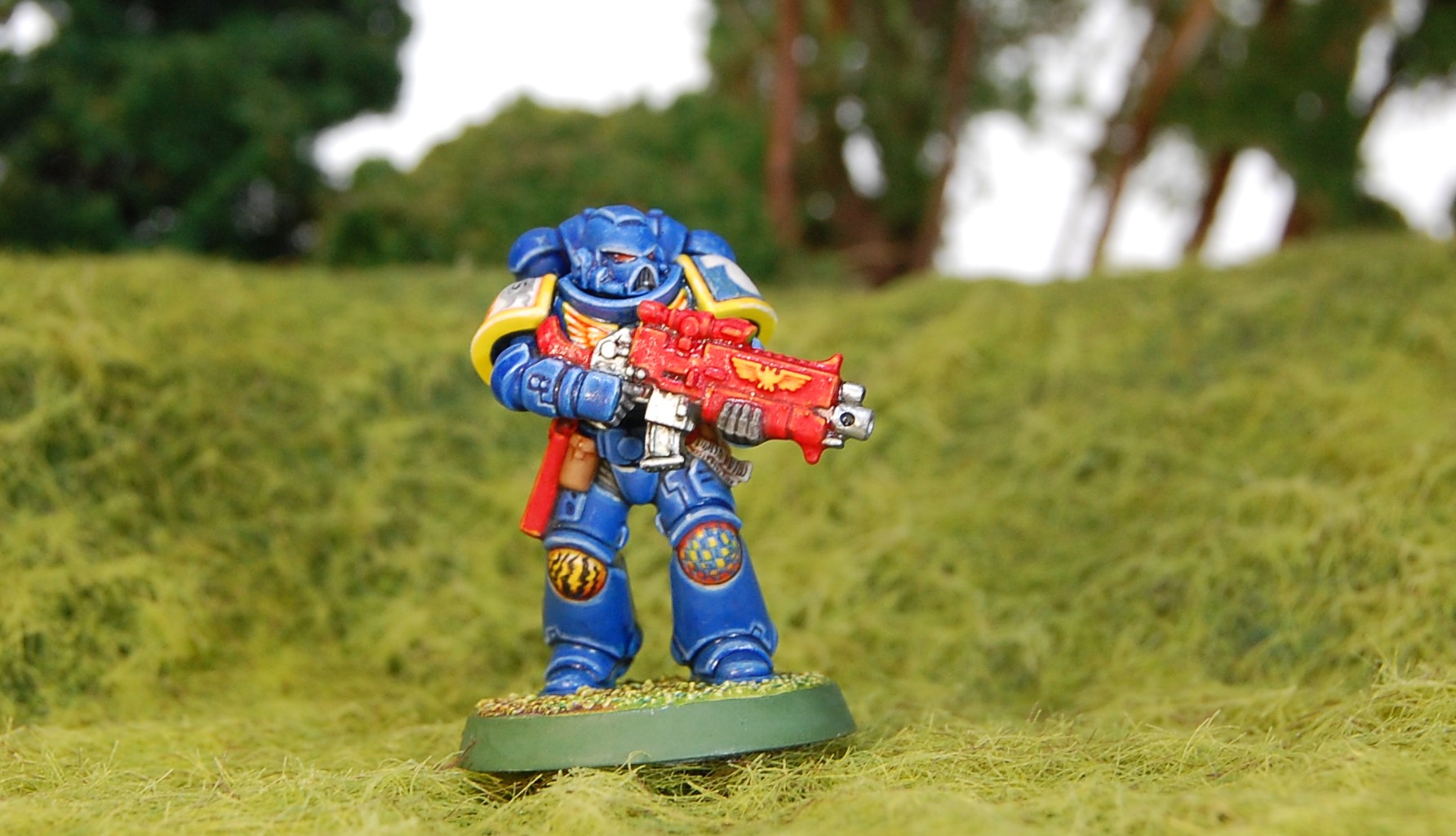
The new Space Marine models are truly excellent, even if the boxed set, easy-to-assemble versions, have some weird elements – some strange poses, some odd undercuts, and so on – they really are good models. And what could be better than painting these new and improved Space Marines in the true colours of the Ultramarines as a homage to 2nd edition?


I don’t know if these new, larger, Space Marines will have a place in 2nd edition. To reflect their stature you would probably need to run them as Terminators, though that brings its own issues. We still plan to keep playing 2nd edition though – 8th for us is a different game, not a replacement. It may allow us to get into the local tournament scene if we build some armies for it, though whether that happens or not remains to be seen (the tournaments, not the armies). In any event, after some indecision I finally decided on some Ultramarines in their classic colour scheme. I have seen one other example of this on the internet, so far.
That decision raised a problem, however. I have always had 2 main inspirations for my miniature painting: Mike McVey, and John Blanche. They are polar opposites in many ways. McVey prefers clean bright colour schemes whereas Blanche’s are dirty and gritty and real (insofar as anything in 40K could be considered “real”). That being said, my favourite ever piece of Space Marine artwork is this one by John Blanche:

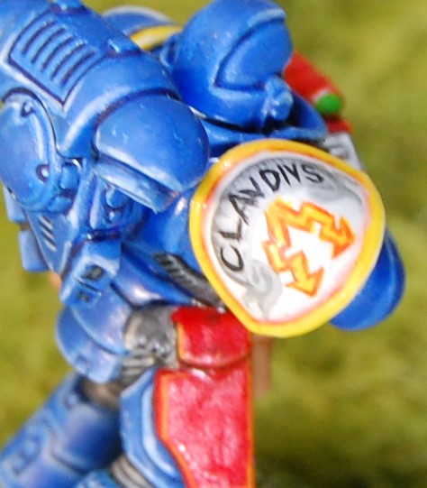
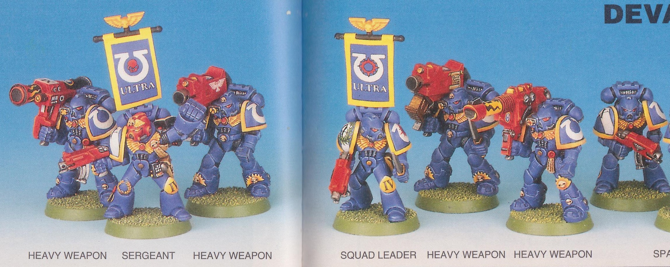
Problematically, it is not in colour. Blanche is famously averse to the colour blue and this raised a query. If Blanche had to do this piece in colour, what colour would he have chosen? Or would he have chosen a different chapter to draw to avoid painting the blue? Interestingly, in the drawings he made for the 2nd edition Chaos Codex, he renders the Alpha Legion and Night Lords in their canonical blue schemes. So, who knows? Anyway, my Ultramarine features traditional Mike McVey colours, with a few Blanchean touches on the kneepads and shoulder pad. Interestingly, there is one ‘Eavy Metal Ultramarine from the 1990s who features a bit of artwork on his shoulder-pad: the Squad Leader from the studio army Devastator squad. I have not been able to find a photo that shows more than 1/3 of the shoulder pad, but it appears to have a laurel wreath surrounding the squad number painted over the Devastator chevron. Anyway, this Squad Leader and the Blanche artwork are together going to be the inspiration for this new army to be painted in a classic style.
Claudius has a head from the 1998 tactical squad box, which I think dramatically improves the look of the model compared to the Primaris helmet. It also helps one to ignore anything to do with the Primaris storyline, as I am trying to do. I also added a folding stock made from a paperclip coated in green-stuff (kneadatite).
Colours used:


White undercoat.
Armour:
Base Coat with GW Regal Blue watered down and mixed with GW Guilliman Blue wash making sure to concentrate on all the recesses. Then block in the panels with GW Ultramarines Blue. Highlights are applied mixing in increasing white, up to pure white for the last edge highlight. It is critical to go up to pure white; this model looked absolutely crap until I put on the final highlight when the armour finally “popped”. Before the final highlight of white though I glazed the whole armour with Guilliman Blue Wash to tone down the transitions between highlights. Despite it being listed here first, I actually painted the armour last (apart from the Regal Blue basecoat which was done first).
Gun casing: GW Blood Red, shaded with GW Red Ink. Highlights with GW Blazing Orange then glazed again with Red Ink before a final highlight of GW Sunburst Yellow.
Yellow: GW Sunburst Yellow shaded with Orange Ink then highlighted with GW Bad Moon Yellow then pure white.
Eye Lenses: GW Scab Red, GW Blood Red, GW Blazing Orange, then GW Dwarf Flesh, with a dot of white for the light reflection.
Pouches: Cote d’Arms Barbarian Leather shaded with GW Chestnut Ink then highlighted by adding white.
Some bits have a weird sort of cracked texture on the surface (the backpack, over the Ultramarines symbol on the left shoulder-pad, on the forehead of the helmet, and on the backs of the legs), this is due to yet another highly frustrating matt varnish disaster. Anyway, I am trying not to get too angry, as I am trying to get through an army of these guys so I don’t want to get too upset about minor imperfections (though I am upset!); I shall try to be as stoic as the Ultramarines themselves would be in the face of such crushing adversity.


Fantastic and Classic mate. Well done. I love your highlighting work. Nice to see a post from you man.
LikeLiked by 1 person
It’s been while, hey!? I have been doing a bit of hobbying but mainly playing games, haven’t had much time to finish any painting or modelling projects sadly.
Thanks for the comments 😊
LikeLiked by 1 person
Also, the edge highlighting was bloody hard work, but it really lifts the brightness of the whole model. Ultramarine Blue is not that bright but the highlights up to white really give it depth and brightness.
LikeLiked by 1 person
Lovely work here. A lot of my own painting harkens back to the days of 2nd Edition in many ways, but this Primaris positively embraces it. The 3e Helmet really ties him in nicely with the models of the day, but the Blanche-inspired freehand takes it beyond most models of those days. Excellent!
LikeLiked by 1 person
I figured the best way to deal with a new edition and new models was to fully embrace a classic paint scheme! Hopefully I’ll build confidence on the Blanche-y side as the army grows 😉
LikeLike
Brilliant! Love it mate, especially the little touches like the Bolter stock and the freehand shoulder pad… superb 🙂
LikeLiked by 1 person
Thanks mate. Pretty happy overall; there’s stuff I’d do different/better next time but as a test piece who will eventually blend into the crowd when he gets a few mates, I think it’s better to crack on than spend too much time fixing everything up. Hopefully they will keep improving as I go.
Glad you like the stock, adds a bit of realism and also harks back to the glory days when bolters actually came with stocks!
LikeLiked by 1 person
Exactly why I like the stock – it’s a lovely touch of detail 🙂
LikeLiked by 1 person
your paiting skills are literally amazing dude!
LikeLiked by 1 person
Thank you, Dadde. This one took a lot of effort. Not sustainable across a whole army (so far anyway!). I appreciate the comment!😊
LikeLike